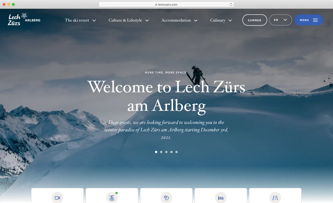
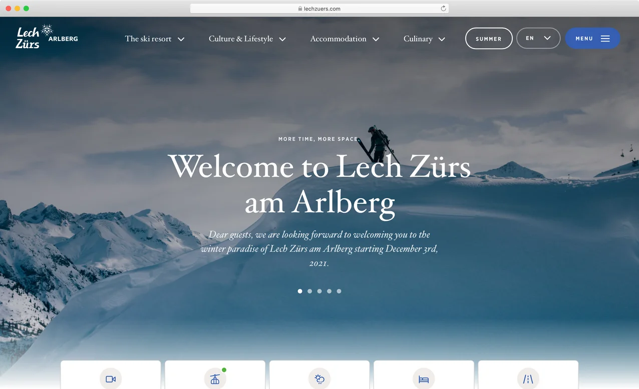
www.lechzuers.com
Seasonal segmentation — highlighting the best of winter and summer for Lech Zürs
How MASSIVE ART helped Lech Zürs highlight the best of winter and summer.

Recently Lech Zürs, a popular mountain destination with a ski resort and member of ‘Best of the Alps’ approached digital agency MASSIVE ART to relaunch their website and highlight seasonal offerings. The two already had a long working relationship — in fact, MASSIVE ART delivered one of their first-ever web projects to Lech Zürs in 1997, on a desktop transported up a mountain by a sleigh (though that’s another story…). Today, MASSIVE ART is a 60-person, full-service digital agency based in Austria, and one of Sulu’s first official partners.
Text
A website built for seasonal offerings
In the tourism industry, there are a lot of seasonal variances, especially for a mountain resort with distinct summer and winter seasons. Lech Zürs offers hiking, biking, and other dryland activities in the summer, with snow sports being the winter highlights. On Lech Zürs’s website, these distinctions need to be clear: hourly operations, highlighted activities, images, and events differ by season.
“Imagery is a really important factor in tourism websites because it draws out visitors’ emotions,” explains Claudia Fischer, the Head of the Business Unit Experience for MASSIVE ART. “It’s important for Lech Zürs’s users to be able to toggle between winter and summer and see different visual content alongside seasonal information.”
As a tourist destination, Lech Zürs needed a multilingual, seasonally differentiated website with the ability to scale. Lech Zürs’s old website had a winter-summer switcher, but it would often malfunction and confuse users, snapping back to “Winter” content after a user had selected “Summer.” Before approaching MASSIVE ART, they’d been using WordPress, but the content they needed to surface was accessed via APIs, which ended up overloading their old website.
Improving upon existing solutions
To design an optimal user experience, MASSIVE ART performed a benchmark analysis of other tourism websites. Many of them used sub-navigation menus for “Winter” and “Summer”, which made users click through multiple options before finding the content they were looking for.
Other tourism websites used “Winter-Summer” switchers, which were better-designed from a UX perspective, but had suboptimal SEO because each seasonal version of a web page had its own URL. For web pages with a lot of shared content, like an “Accommodations” page, two different URLs meant a lot of duplicated content, which makes search engines like Google lower the page rankings.
“There was no perfect example,” says Fischer of their benchmark analysis. “With the sub-navigation option, users always had to search through the full portfolio, and using different URLs for winter and summer was bad for SEO. MASSIVE ART borrowed the UX design of a “Winter-Summer” switcher, but came up with a better solution for SEO optimization and URL structure using Sulu’s segmentation function.”

A seamless user journey for every season
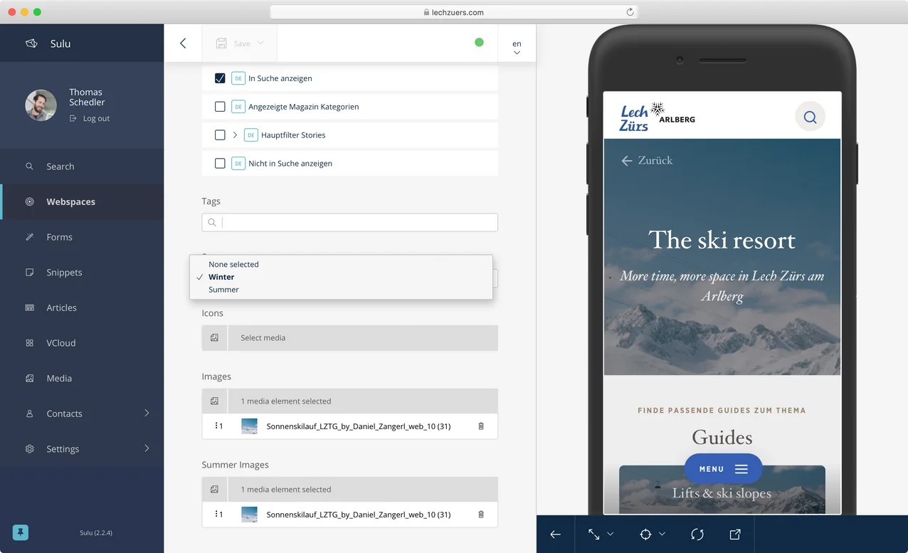
Sulu’s “Segmentation” feature lets content editors create, manage, and customize content based on a set of pre-defined segments, configured by developers. In Lech Zürs’s case, the segments were “Winter” and “Summer.” Using Sulu’s Segmentation feature, content editors can designate whether a page is winter-only, summer-only, has differentiated seasonal content, or appears the same across seasons.
MASSIVE ART also built a “Winter-Summer” switcher, which allows Lech Zürs’s website visitors to choose which content they see. Once a user selects a season, the website’s seasonal content, navigation, images, and text all update — but not the URL. This is much better for SEO across locales.
Segments can be added to content blocks from within Sulu’s content editor UI as well, so the content editor has full control over which images, links, and text are shown per segment. Sulu also offers a live preview for each segment, so Content Editors can see a draft version of the summer or winter segments and make sure no content is missing.
“Lech Zürs is really happy with how intuitive Sulu’s interface is,” says Fischer. “Content editors can easily manage the segmentation for entire pages and content blocks within shared winter-summer pages.”
In Sulu, you can also set default segments, so that if a user searches for “Lech Zürs” on Google from November to April, for example, the website will default to the winter version, whereas afterward, it switches to summer. In either case, the user will always have the option to choose their own journey through the Switcher.

Scalable, multilingual webspaces
Another priority was the ability to add new web spaces, languages, and APIs. The Lech Zürs website has German and English versions, and with Sulu’s localization solutions, languages are configured from within the CMS rather than through a translation plug-in.
“Sulu’s system is really scalable,” says Fischer. “So if a customer chooses Sulu, they’ll get a stable technical foundation, and can install additional functionality as needed, without worrying about the system's performance.”
For example, MASSIVE ART was recently tasked with creating a new website for Lech Zürs’s annual ski race, The White Ring (Der Weiße Ring), in advance of the 2022 event. Rather than initializing an entirely new project, MASSIVE ART added it to Lech Zürs’s Sulu installation, so Content Editors were able to access shared images and resources across both webspaces. The White Ring is only a winter event, so no seasonal segmentation was added, but if another webspace needed the winter-summer switcher, segments are sharable across webspaces.
Our Partners
Become a Partner
Sulu’s segmentation feature isn’t only for tourism organizations. “Any web page with specific segments of content benefits from this functionality — for example, a company servicing both individual end-users and other businesses might want a b2c and a b2b segment when describing its offerings,” says Fischer. With Sulu as an official partner, MASSIVE ART plans to continue individualized experiences for their wide variety of digital clients.
Concept, design and implementation by

Case Studies

